MobileOne
Challenge
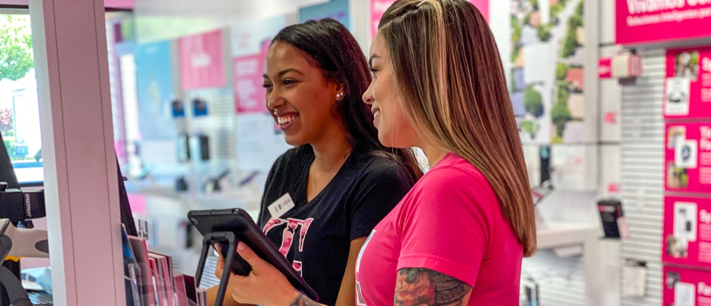
With over 120 stores throughout the U.S., MobileOne is one of the largest operators of T-Mobile retail stores. To achieve their goals of growing their company, attracting new and more diverse employees and revitalizing the company’s culture, they needed a brand overhaul. Their goal was to position themselves as a vibrant, youthful and energetic company that millennials would love to work for.
Solution
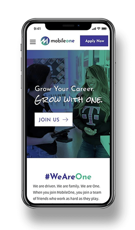
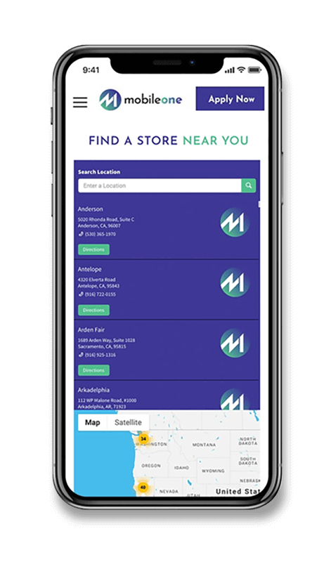
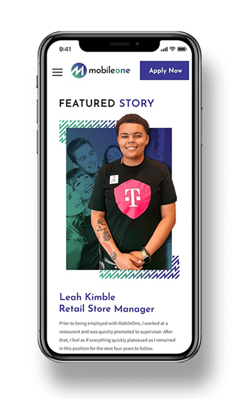
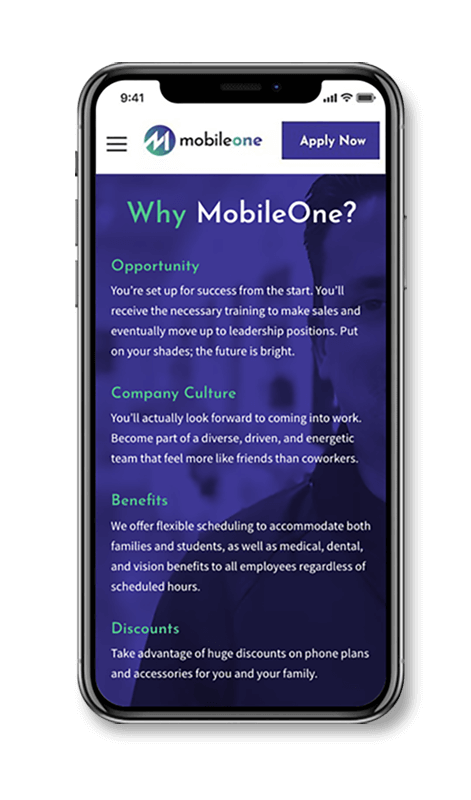
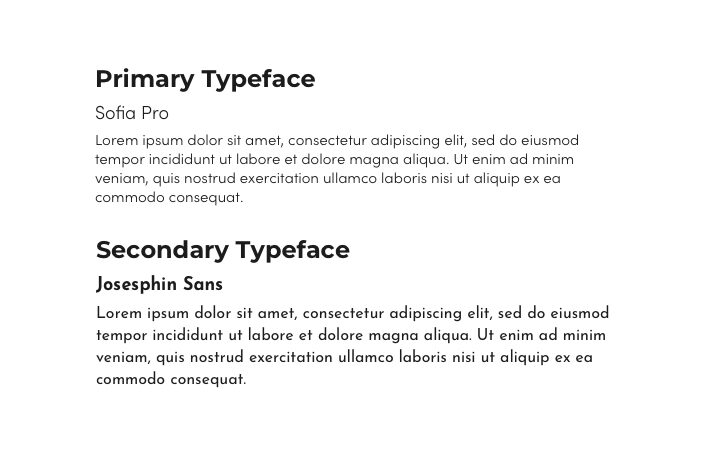
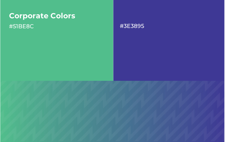
Our creative team started the engagement by producing a new logo design. It consists of the characters “M” and “1” stylishly fused on a vibrant blue-to-green color gradient. Next, we began our website discovery phase and came up with a mobile-first strategy for a new WordPress website that highlights company culture, benefits and why a site visitor would want to work at MobileOne.

A Logo Full of Energy
We created a custom monogram in a simple and modern treatment with the number 1 nested into the M. The icon represented a place to grow sales and elevate your career. Also the upward diagonal of the shape hints of mobile phone reception bars and growth.
The Impact
MobileOne’s new visual aesthetic is one that website visitors find very appealing. And the simplified navigation, with just five main items—one being a prominent Apply Now button—leaves no question about how to get where you want to go.
Increase in Store Locations
Increase in Hires
New States to Operate in
If You Build a Better Brand...
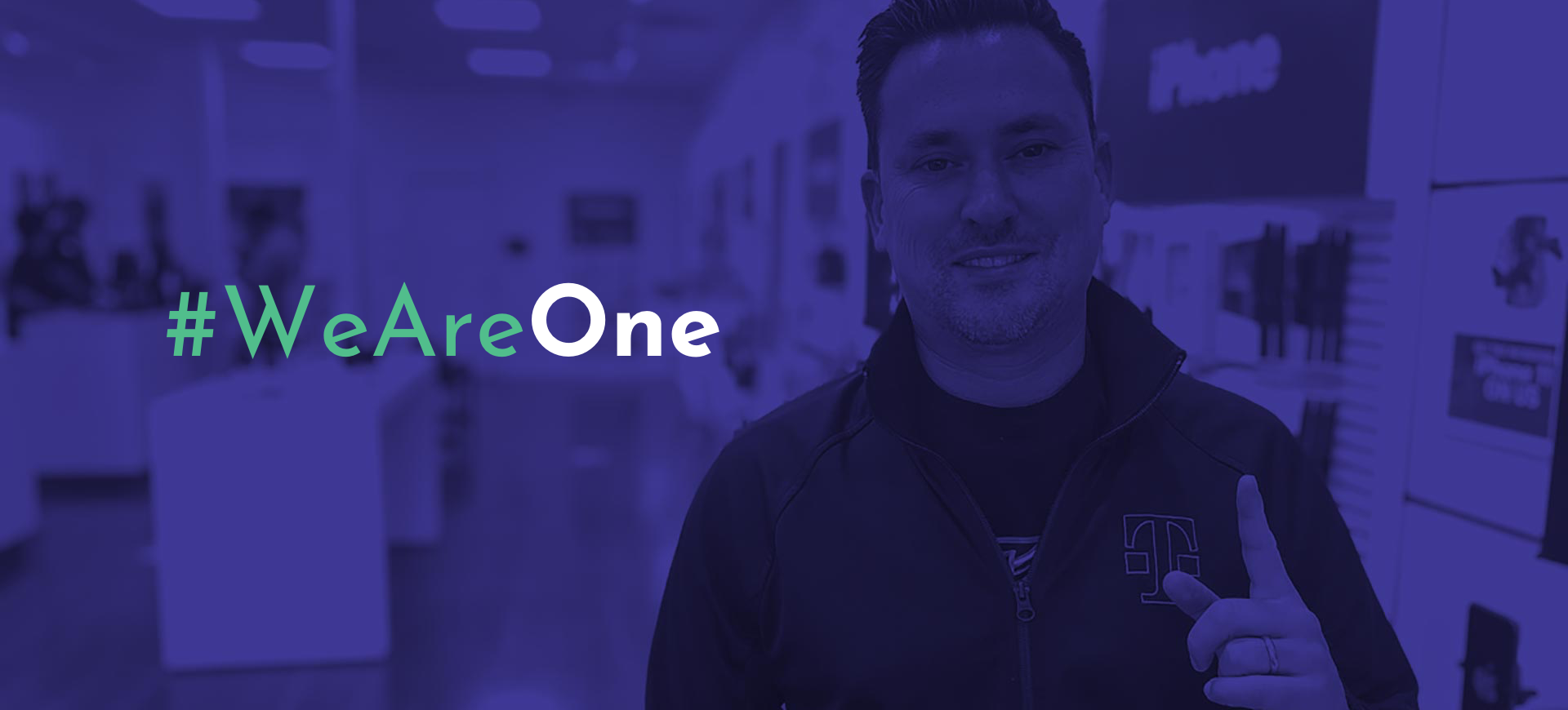
Some companies address branding as an afterthought. “It’s just colors and shapes,” the thinking goes. MobileOne knew better. It’s true that even the most visually appealing brand isn’t going to land top talent for your organization on its own. But well-conceived branding and design does check a box for many image-aware job hunters, who will leave a website without a second thought if the brand is outdated or “cheesy.”
The branding we executed for MobileOne greatly enhances their image, making it easier to connect with potential employees.
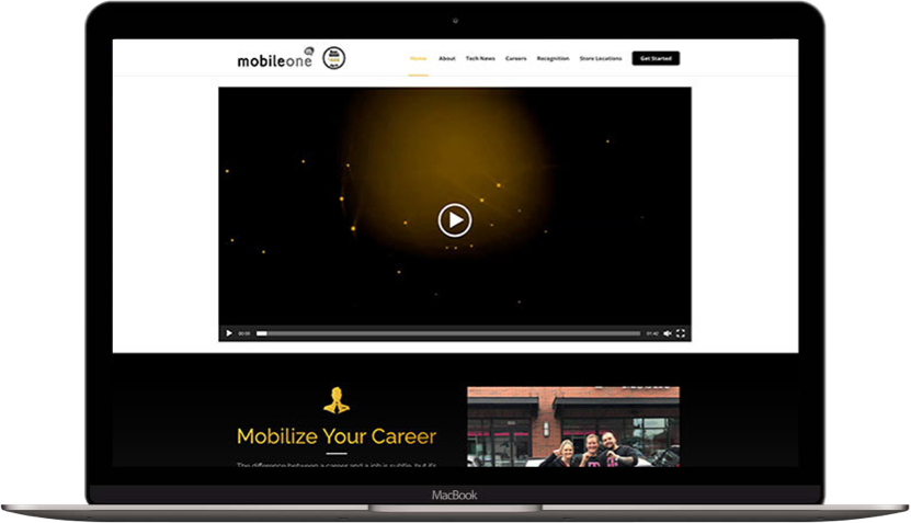
Before
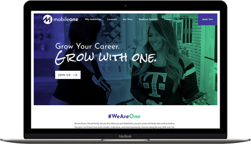
After
