Medmont
Challenge
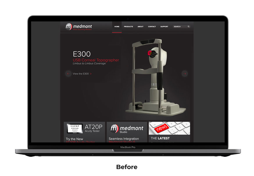
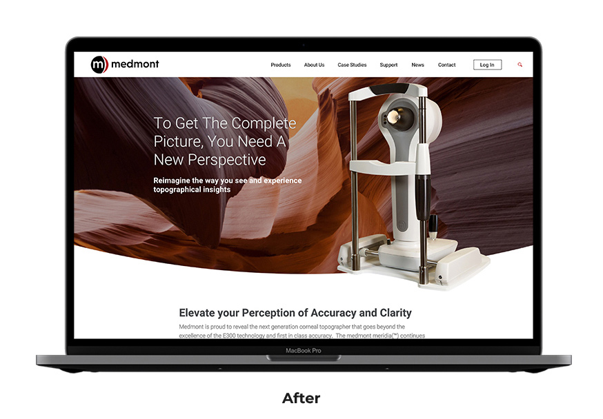
An established ophthalmology company, Medmont, offered first-class technology and medical devices but needed an updated identity and new website that accurately reflected the benefits and quality of their products.
Solution
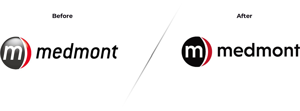
For the brand design, less is more. Removing dated 3D effects and updating the typography made their logo feel fresh and contemporary. Next we focused our efforts on building a new website. Our team established a new site architecture tailored to the user’s needs and communicated the superior benefits of their products.
Brand Update
A clear vision for the online experience
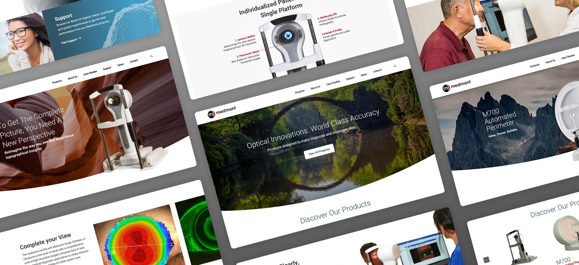
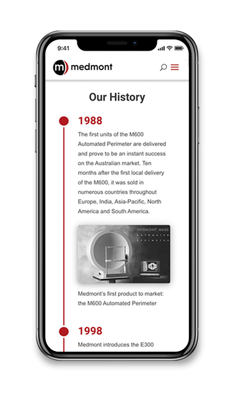
The new design focused on educating practitioners about the benefits of their superior products. Interactive elements were weaved into product pages throughout the site to aid users in understanding complex product specs and features. It was also important to provide support to professionals so that they return to the website and become long-term customers. Downloadable resources, software updates and articles were added to create a knowledge hub for ophthalmologists world-wide.
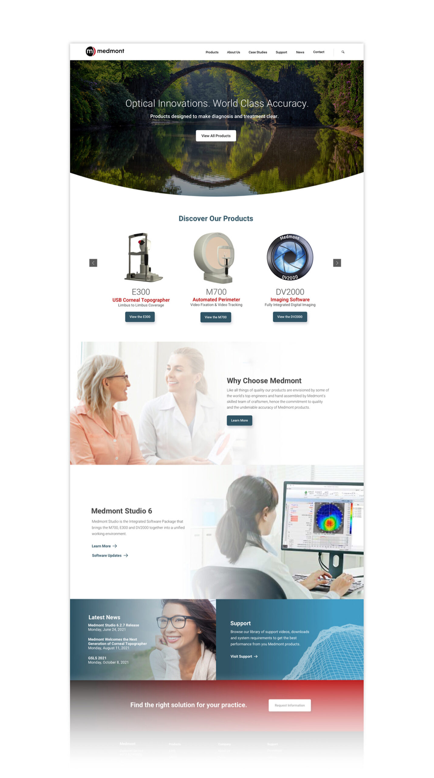
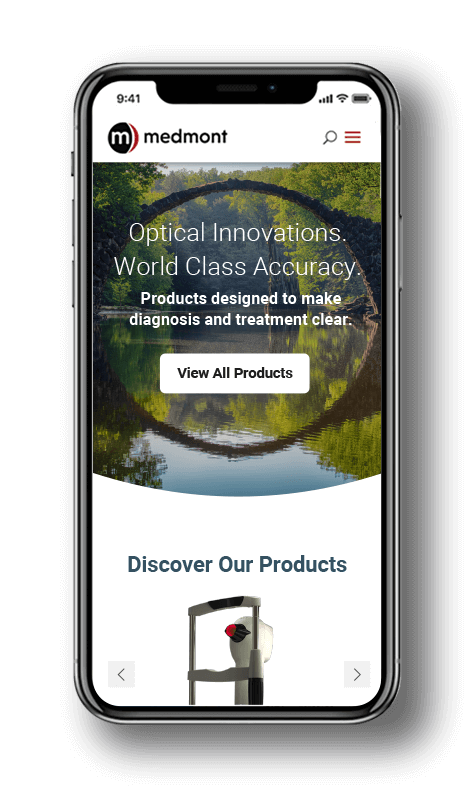
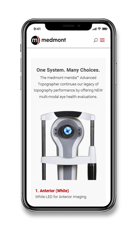
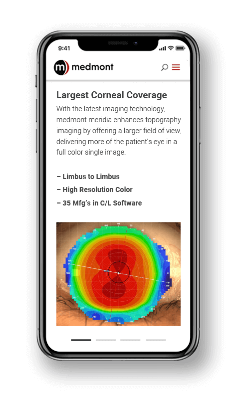
Bringing the next generation of optical devices into light
On top of improving the website design, we also built it on Wordpress so that updates could be easily made and new resources for their customers could be added as their product lines grew and advanced. Their new brand and online experience accurately portrayed Medmont as global leader in optical innovations.
